Chérie Chéri :
High-end women's ready-to-wear boutique.
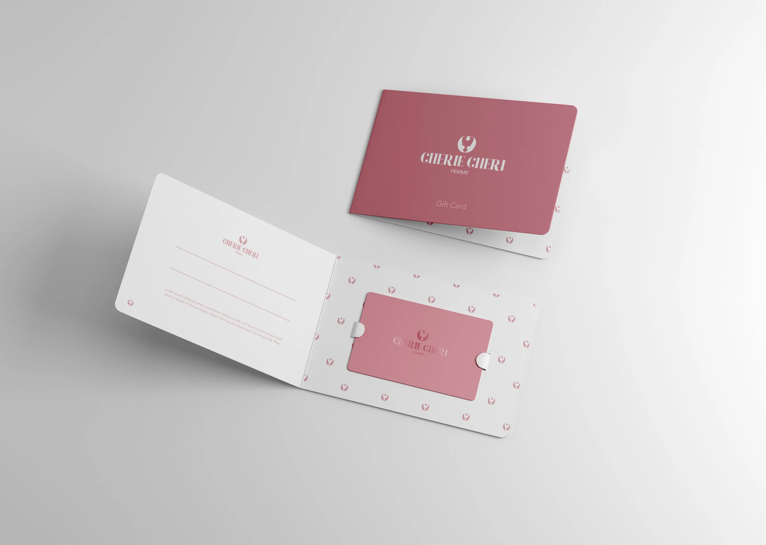
The complete redesign of the graphic identity for the high-end women's ready-to-wear boutique "Cherie Cheri" represents a major step in the brand's evolution. This initiative encompasses the creation of a new logo, shopping bags, business cards, gift cards, stickers, and even pens, aiming to provide a consistent and luxurious visual experience at every customer touchpoint.
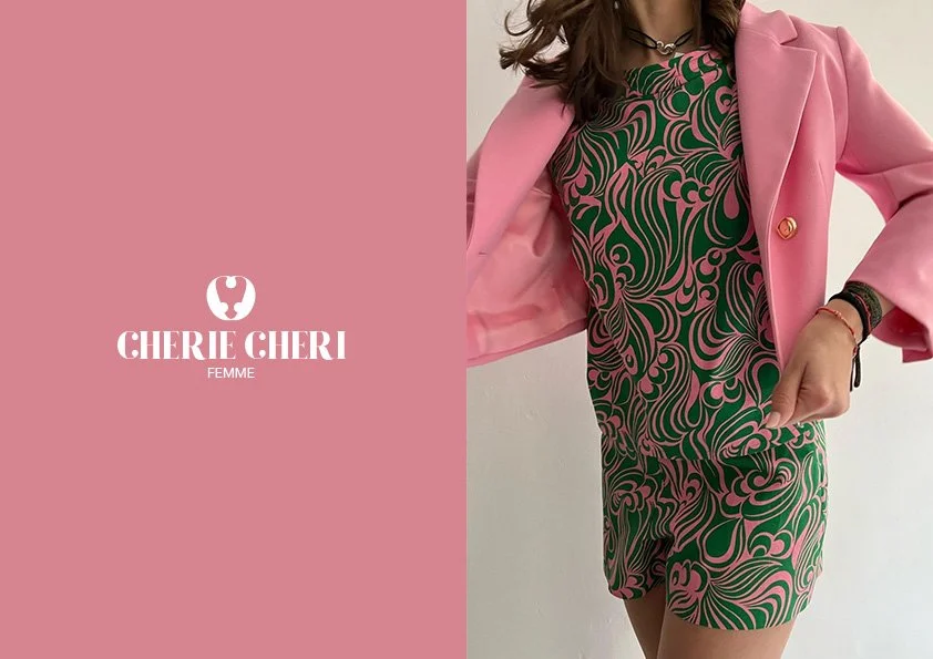
The redesign process particularly focused on revitalizing the boutique's Instagram account. With a focus on carefully crafted photographs, the content now centers on the high-end clothing offered by "Cherie Cheri." Each image has been selected to reflect the timeless elegance and exceptional quality of the boutique's products.
Regarding the color palette, pink and white were chosen to maintain continuity with the base color while adding a touch of refinement. In this redesign, pink evokes a 70s aesthetic, giving it a retro and timeless character. This more discreet shade complements white perfectly, creating a visual harmony and recalling the very interior of the store, where these hues predominate.
The chosen typography is rounded, adding a soft and welcoming dimension to the brand's visual identity. The logo was specifically designed to evoke a heart, symbolizing affection and attachment reflected in the name "Cherie Cheri." It also embodies the high-end essence of the boutique, with clean lines and an elegant aesthetic.
Overall, this redesign aims to strengthen "Cherie Cheri's" position as a must-visit destination for high-end women's fashion. It provides a distinctive visual identity that will capture customers' attention, enhance brand awareness, and reinforce its image of excellence in the fashion industry.